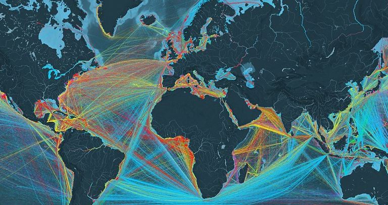
Highways of the Sea: Interactive Map Shows Every Merchant Ship Route on the Ocean
 A new visualization shows just how busy the world’s oceans are.
The beautiful interactive map created by data visualisation firm Kiln, shows every merchant vessel that traveled on the ocean in 2012. It is based on data from the UCL Energy Institute.
‘You can see movements of the global merchant fleet over the course of 2012, overlaid on a bathymetric mapm’ they say.
‘You can also see a few statistics such as a counter for emitted CO2 (in thousand tonnes) and maximum freight carried by represented vessels (varying units).
The map shows five types of ship, from containers to tankers.
Container (e.g. manufactured goods): number of container slots equivalent to 20 feet (i.e. a 40-foot container takes two slots)
Dry bulk (e.g. coal, aggregates): combined weight of cargo, fuel, water, provisions, passengers and crew a vessel can carry, measured in thousand tonnes
Tanker (e.g. oil, chemicals): same as dry bulk
Gas bulk (e.g. liquified natural gas): capacity for gases, measured in cubic metres
Vehicles (e.g. cars): same as dry bulk
Source: Nairobi Wire

COMMENTS